Basic Macro Photography
The GIMP - Using the Levels Tool
|
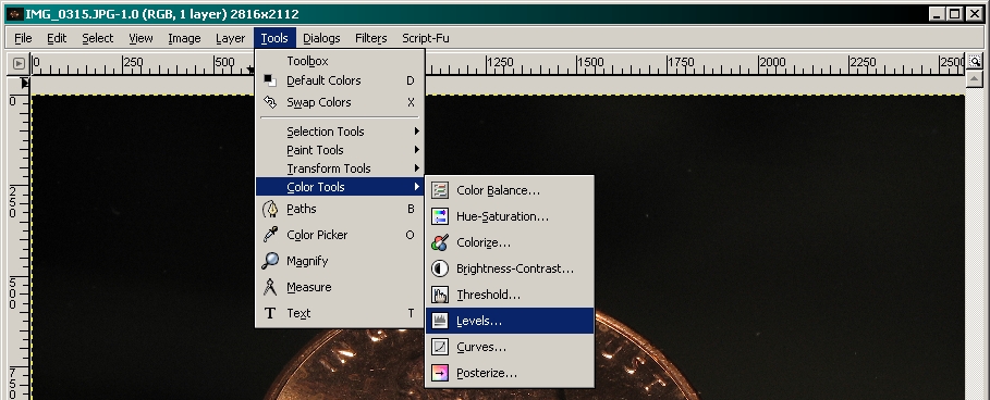
Using the levels tool can salvage many photos that were previously useless. Of course, it's best to get the exposure correct (or very close to correct) when taking the shot but this helps when it's not quite right. When you take a photo, you should end up with an image that includes the full range of brightness (pure black to pure white). In underexposed photos, there is little or no white. In photos with poor contrast (mostly look gray), there is little at the ends of the spectrum (black and white). This is the way to the tool...
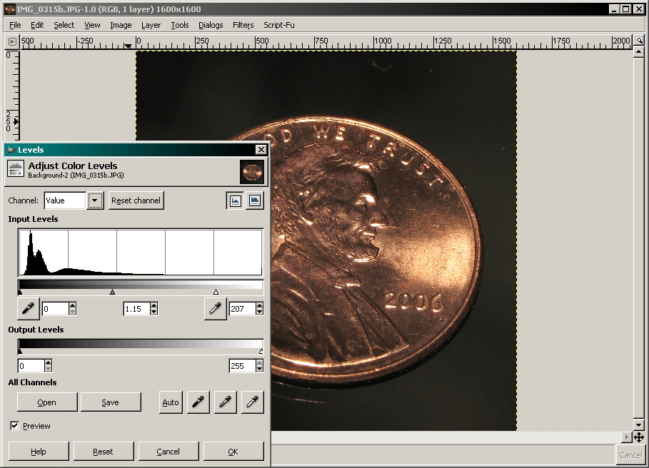
 In the following photo, you can see a photo that's generally too dark, too contrasty and has areas blown out. It's a mess. There's really nothing that we can do about the areas that are blown out but we can correct most of the rest of the problems. The controls on the levels palette have not yet been changed.
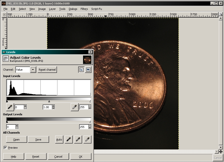 This shows an improved image. More items were made brighter and the contrast was reduced.
 In the next photo, you see an under exposed image. In the object itself, there are no areas that are near the maximum possible level (pure white).
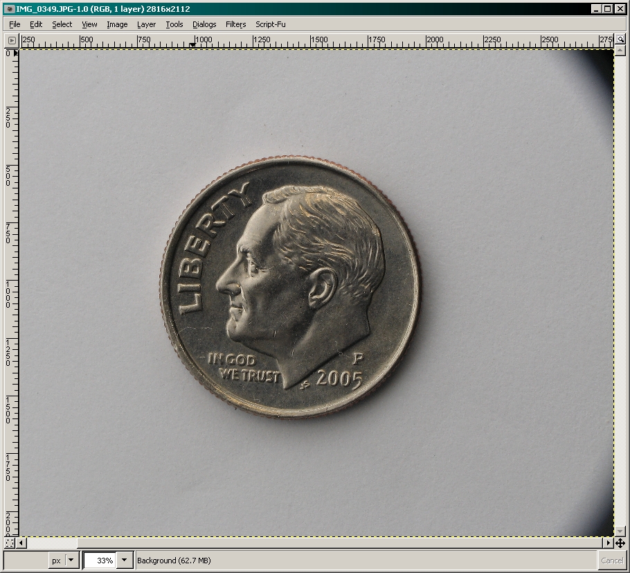
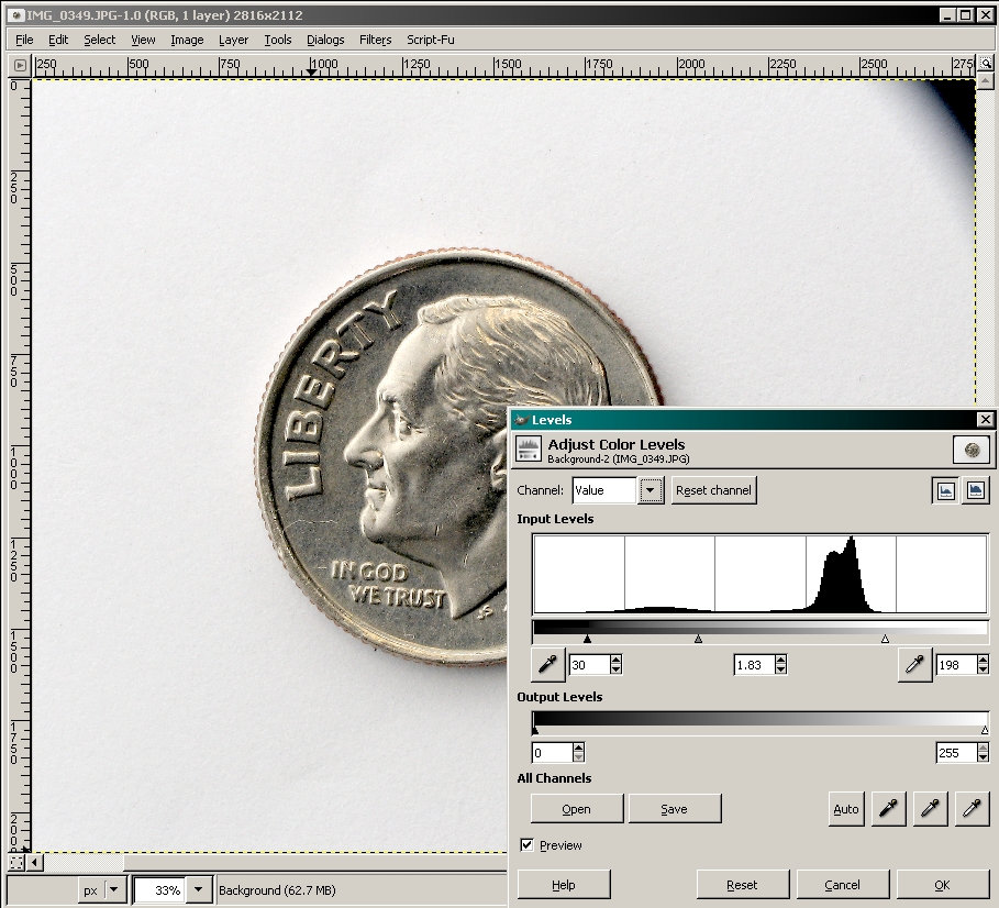 Above, you can see how the brightness of the image doesn't reach the ends of the histogram. The following image is after the the level tool was applied. You can see that the largest part of the black area of the histogram is now (after the new levels have been applied) very close to the maximum white end of the spectrum.
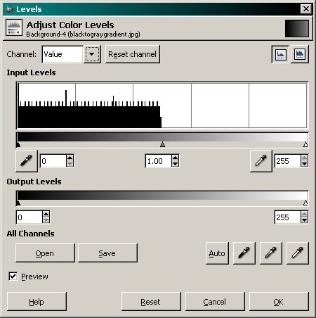
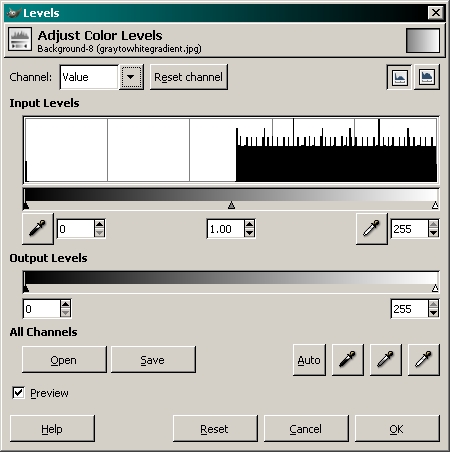
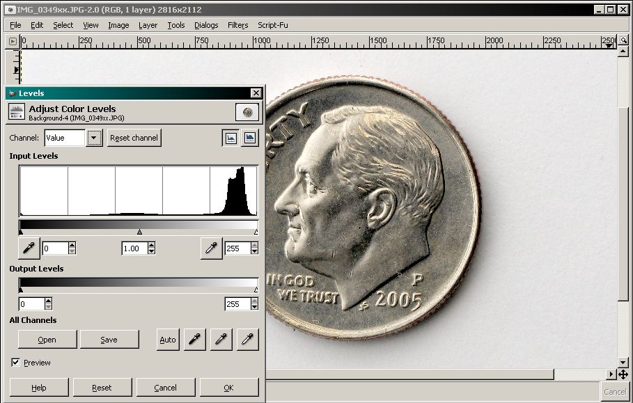 To better understand the histogram (the graph), I've created two files that cover only half of the light-dark spectrum. The first begins with black and goes to gray. The second starts with gray and goes to white. Note how the files are represented in the histogram.
In this one you may think it strange that black (the far left of the histogram) shows up in the histogram. Well... The file has a thin black border. That accounts for the black level in the graph.
This next file shows, in fine detail, the information in the histogram. The left image is from a very poorly exposed photo. The right image is from a photo with blown highlights. Look at the right-most edge of the right histogram. There is a significant portion of the image that was at the maximum white level. The left image shows that there was no white and very little light gray.
 |
Notes:
|
