Basic Macro Photography
The GIMP - Using the Curves Tool
|
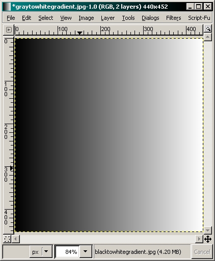
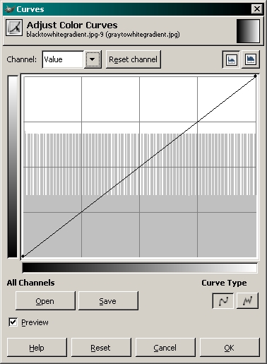
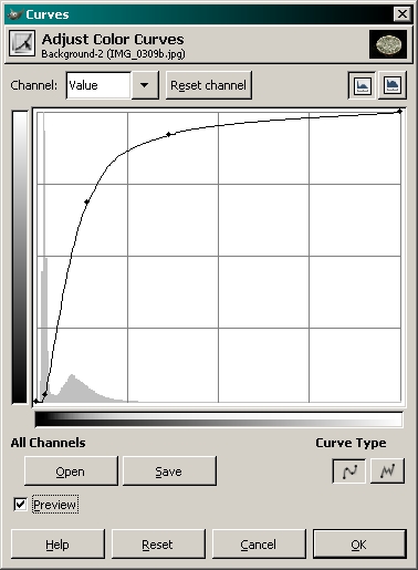
Before we begin, let me say that you can make a mess of a photo with this tool but when used properly, it can be very useful. To begin, I'll show you how the tool works with a grayscale sample. This makes it easier to understand the basic problems that can occur. To get to the tool... TOOLS >> COLOR TOOLS >> CURVES Here, you can see the sample of a black to white gradient on the left and the curves tool palette on the right. If you look at the histogram in the window, you can see that all variations (from black to white) in the entire spectrum are evenly represented.
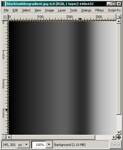
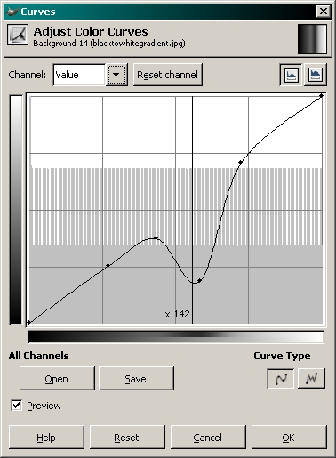
To understand this tool, you need to understand the tool window. The vertical grayscale bar is the output level. You can think of it as the 'after' level. The bottom half of the bottom grayscale bar is the input level. Think of it as the 'before' level. Before any changes are made, the line is straight. This means that the 'before' level at any point on the gradient is going to be the same as the 'after' level. If you select the center point on the line, moving it up will make the midtones in the image lighter. The lightest and darkest points will remain unchanged. When you make a part of the curve more vertical, you make the part of the spectrum under that part of the curve more contrasty. For example, when you move the center point of the line up, the tones darker than that point will have more contrast. The tones above that point will have less contrast and will be lighter. Adding more anchor points will allow you to make changes to various parts of the spectrum. It's best to make very small changes in the shape of the curve. Sharp vertical jogs in the line will result in overly contrasty/blotchy results in real-world images. Here, you can see the same gradient after the curve has been modified.
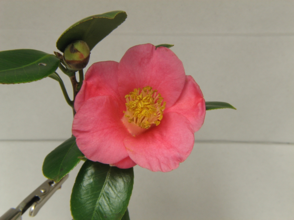
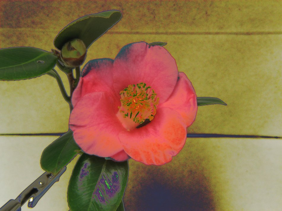
I applied the radical curve from shown above to the following photo. As you can see, the results are not good.
|
Notes:
|
