|

|
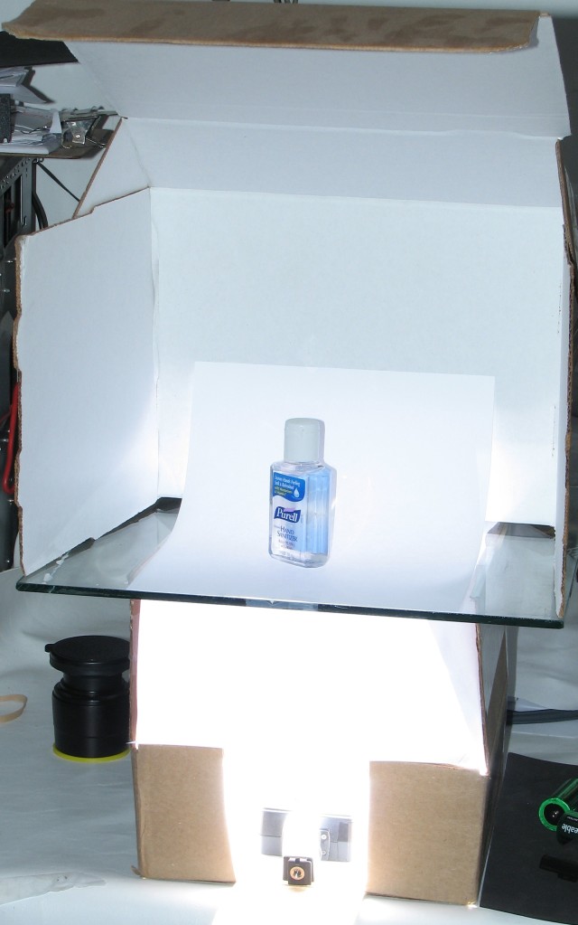
This was the setup for this part of the tutorial. When the photo was taken, the lower flash was on so it fired. You can see how much the 3-4 sheets of paper throttle the effective output (reaching the bottle).
It has many of the common items used in other parts of the site.
The white box folded inside out reflects light and helps reduce shadows.
The piece of paper sweeping between the vertical and horizontal surfaces prevents having a crease show where the surfaces meet.
The box that supports the piece of plate glass is lined with white paper to help reflect as much light as possible and it keeps the brown interior from influencing the color of the light.
The lower flash is an inexpensive, vintage Canon Speedlite 177A.
An inexpensive slave trigger is mounted to the flash.
Pieces of paper are laid on top of the flash to help reduce the effective output as well as to diffuse the light.
A styrofoam cup was used as a diffuser.
|

|
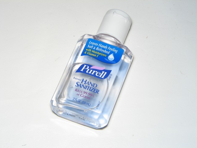
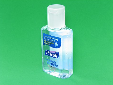
This is a photo of the bottle taken with no reflectors or other items that can help to make the photo a bit better or more interesting. In general, the photo doesn't have any serious problems. It's in focus. The exposure is OK and it has good contrast... but it's not very interesting. Hopefully, a few of the following images will be a bit better.
|

|
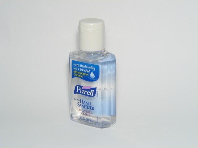
This photo used only the on-board flash.
|

|
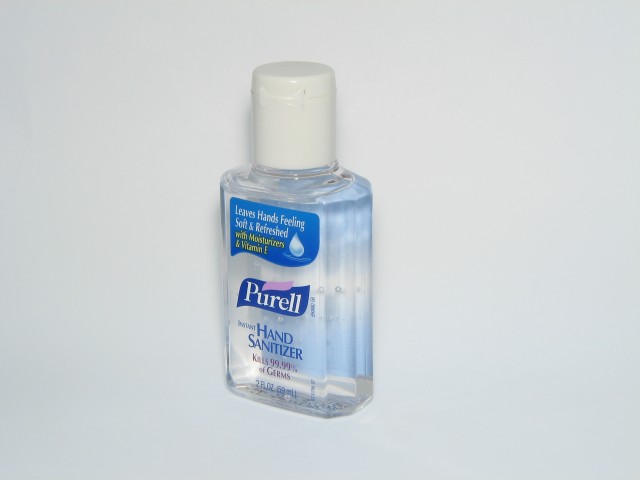
Here, I set the slave flash to low power. If you look very closely, you can see that the area around the base of the bottle is a bit lighter than the previous image.
|

|
For this photo, I set the flash to full power. As you can see it's just a bit too bright. :)
|

|
To reduce the effective output of the slave flash, I placed a single sheet of paper over the flash. It reduced the output a bit but not enough.
|

|
Here, there are two sheets of paper over the flash.
|

|
This shows the results with 3 sheets of paper over the flash. This is just about what I was looking for.
|
|
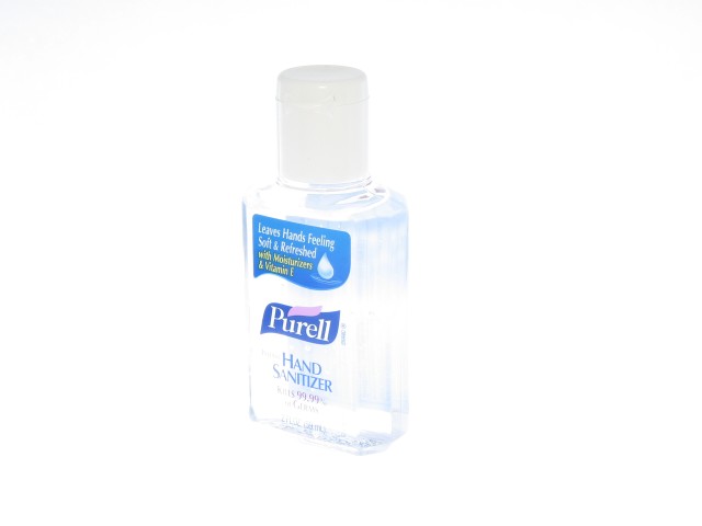
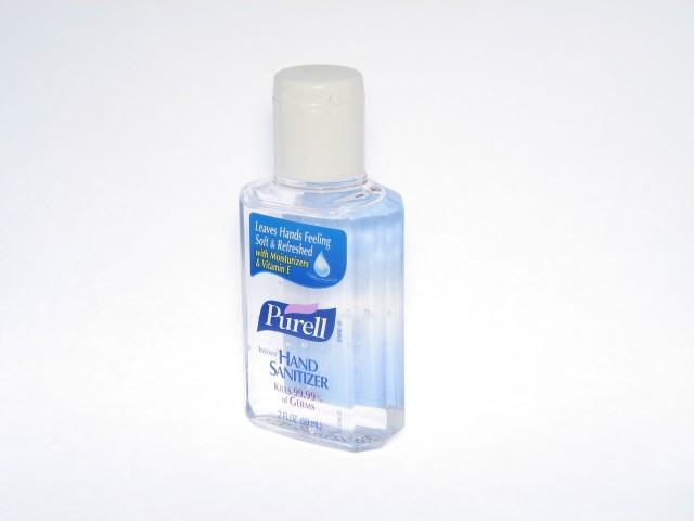
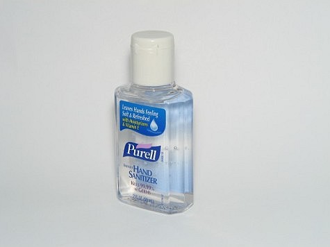
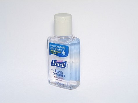
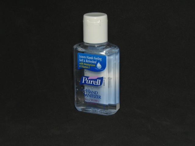
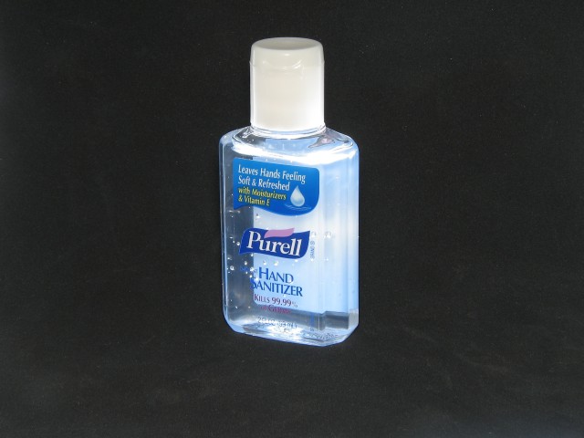
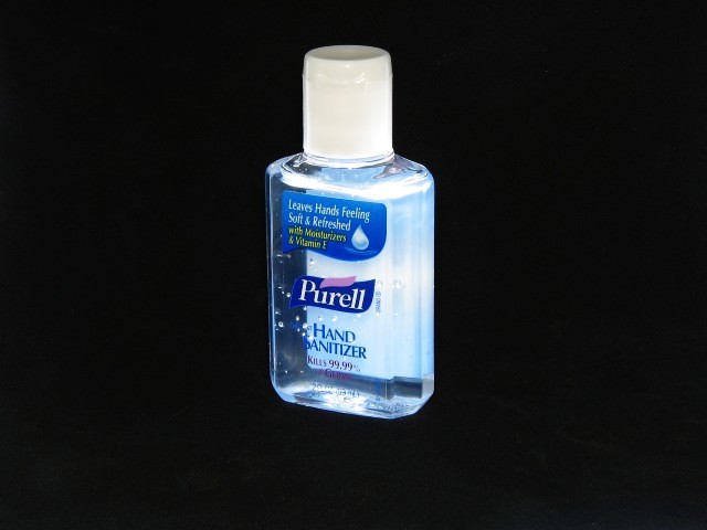
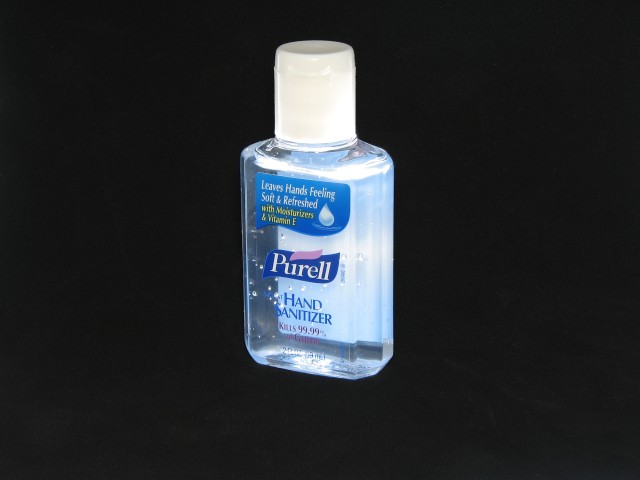
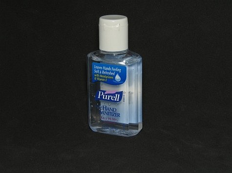
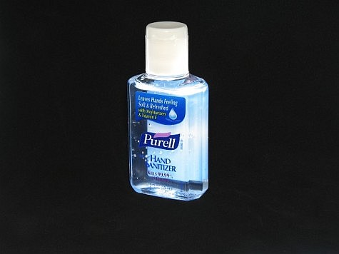
You can compare theses side by side. The left photo is without under-lighting. The right used the slave flash. You can decide if it was worth the effort.
|

|

|

|
The white background didn't really work well with the clear bottle and contents in my opinion. I decided to try it with a black background. This is OK but it can be better.
|

|
It's obvious that the flash will not be effective trying to light the bottle through the black foam padding (Wal-Mart arts and crafts department). I cut a hole roughly the shape of the bottom of the bottle (just a bit smaller than the bottle's footprint). I then fired the flash through the hole and up into the bottle.
|

|
This is the photo shown above but I edited it in the GIMP. I used the curves tool and set it to an 's' curve (very slight curves here). Pushing the bottom of the curve to the right darkened the background. Pushing the top of the curve to the left increased the brightness of the light objects and slightly reduced the contrast. The quality of this photo is probably good enough for many applications (eBay, mom & pop internet sites...).
|

|
Previously, I used the curves function to manipulate the entire image. In this image ant the next image, I used the select tools to manipulate select areas. In this first image, I selected the background with various select tools and darkened it.
|

|
Here I inverted the selection and made a few changes to the bottle. I used the levels tool to increase the overall contrast of the bottle. I then deselected everything except the cap and again used the levels tool to lighten it. This takes more time and effort than the curves tool but it gives more control over various areas of the photo.
|
|
Again... You can compare theses side by side. The left photo is without under-lighting. The right used the slave flash. You can decide if it was worth the effort.
|

|

|
|
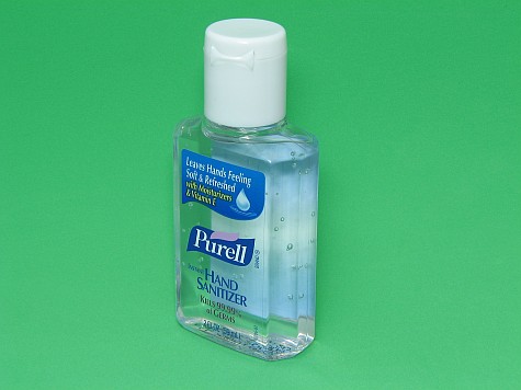
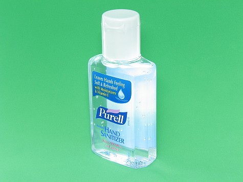
The left photo is without the slave flash. The right used the slave flash.
|

|

|

|
Here, I used the curves tool in the GIMP to return the background to nearer the color it was without the slave flash (light from the bottle actually lit part of the green foam). Since it affected the entire image and wasn't selectively applied, it also increased the contrast of the bottle.
|
OK, no one is going to spend this much time on a bottle of hand cleaner but it shows how you can make a few simple, inexpensive changes to dramatically change the appearance of the item.
|
